BRANDING
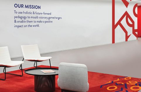
In order to strategically position the brand, VGC undertook an in-depth research exercise, studied the market, category & competition, and spoke with students, faculty, recruiters, an exam administering body and many more, both in India and abroad. The insights revealed that people preferred a brand that was inspired by heritage, yet modern at the same time. These insights were then used to uniquely position the brand and also to develop BITSoM’s vision & mission.
Leading from the brand positioning, in order to develop the new identity, VGC – as an expert branding agency, identified key aspects of the new brand and brought them to life through relevant symbolism within the concept of heraldry (an ancient practice, still in use, where elements of nature that have specific representations, come together to create a unique crest or symbol that collectively becomes an identifying mark for organisations, families or even governments).
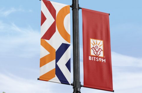
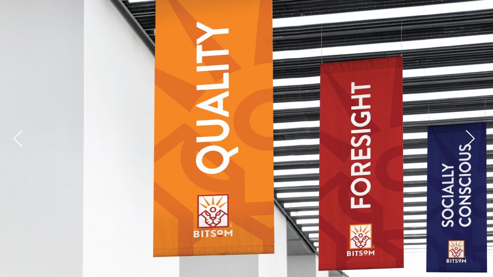
The symbols taken forward were the Tiger – representative of India, leadership, agility & vision, and the Sun – representative of new beginnings, a fresh approach, the origin & energy. The brand identity collectively represents BITSoM’s origins, it’s global outlook, future-focus and emphasis on moulding next gen leaders for a new age world. While the initial ask was to create a brand identity for a business school, VGC went a step further and delivered a brand that is entrenched in key insights, new age symbolism and a focus on the future.


