VGC Paints a Picture of Shantaram’s Mind for Elle Decor
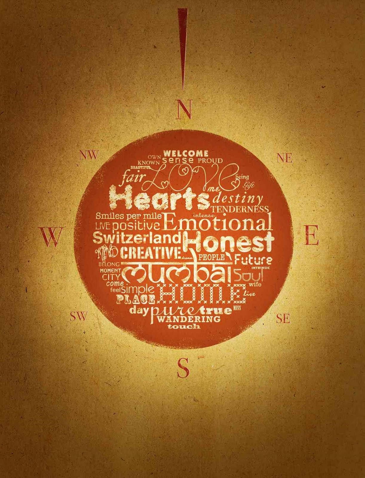
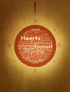
Elle Décor magazine ran an essay about what ‘Home’ meant to Gregory David Roberts author of the famous book Shantaram. And Preeti Vyas and team VGC were invited to create a typographic sketch inspired by his essay.
Having lived all over the world from a prison in Australia to New Zealand, a slum in India, the battlefields of Afghanistan, Germany and now Switzerland, the famed writer had evolved a very unique concept of ‘home’. So Preeti Vyas and VGC took words and sentences from Gregory’s essay and put them in a compass, as he refers to ‘the needle of his mind’s compass’.
The typography reflects his own character that has attained a kind of ruggedness, having being wrought by every place he has visited and been influenced by.
Which brings us to Typography and how it may be used as a strategic tool in emotional branding
Typography conveys a cogent portrait of a brand’s personality. Some people proclaim typography to be an emphatic, distinct and powerful Visual Voice. Still others liken it to garments that words wear. Typography analyst Caroline Archer once said “just as we make judgments about people by the clothes they wear, so we make judgments about the information we’re reading by the typefaces.”
In branding, the way letters are designed to convey a message, can bring important emotional connotations to the fore. This appeals to that part of people’s brains, that decode typography on a subliminal level, picking out nuances that would otherwise entail lengthy explanations. So, in other words, typography can be the most concise way to tell the story of your brand.
Let us pretend we are trying to brand the city of Rome. Now which stands out as most likely?
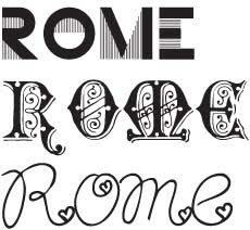
The first option is very modern and edgy for such a historic city, and the third option is clearly too blithe and inconsistent with our image of Rome as being the cradle of one of the world’s oldest civilizations. As you can see the word is the same, but it is the typography that made all the difference.Many brands have been built using Typography. CASIO uses a very electronic digital font that immediately conjures up images of what the brand sells. IBM’s thick font and soothing blue and white stripes conveyed its dependability and consistency. Sharp, Lego, Hitachi, Sunkist are just some famous brands that have used typography to convey their brand essence.Even magazines convey their brand essence through typography. For instance Vogue’s Bodnoni serif font conveys style and elegance.The Time magazine’s font conveys its authority as the disseminator of latest news. And National Geographic’s font expresses its pioneering spirit and responsibility towards the world’s cultural, historical, and natural resources.
As you can see, Typography is a powerful tool in branding, and some of the worlds most famous brands have recognised this, and used it to their advantage.
To dive deeper into our proprietary process, Designomics, visit our website: https://www.vgc.in

