Based on the conversations we had and the insights gained from our research, we made the strategic decision to position Amara as- “A future-focused, senior living residential brand that empowers those planning their future to live an active and joyful life.” This positioning was encapsulated by its tagline, ‘For the Joy of Living.’
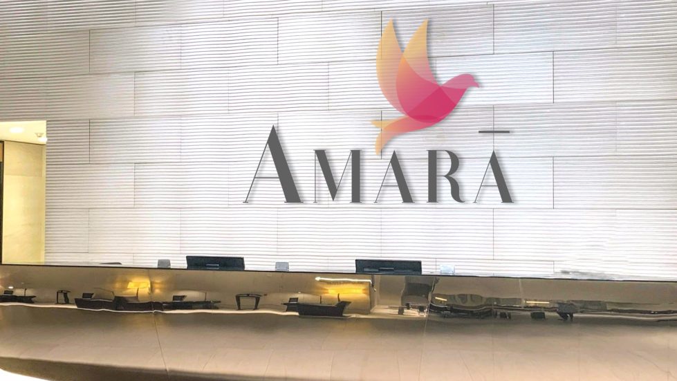
The identity we crafted for Amara features a key symbol and 3 meaningful colours that brought our positioning to life. A Dove, which is a universal symbol for freedom which was then enhanced with overlapping colours to represent the different phases of life- pink for love and happiness, orange for comfort and joy, & a gradient for life’s transitions.


