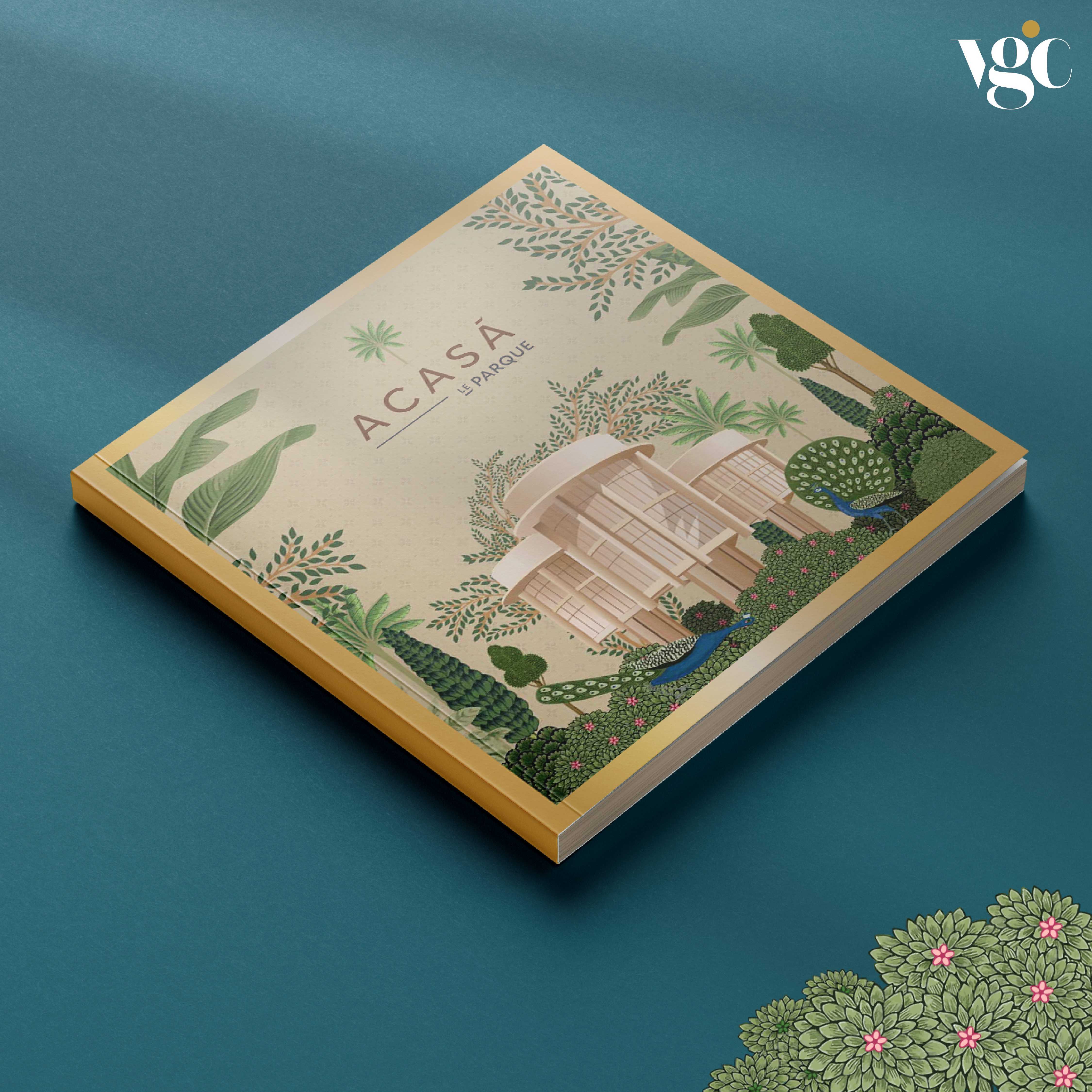
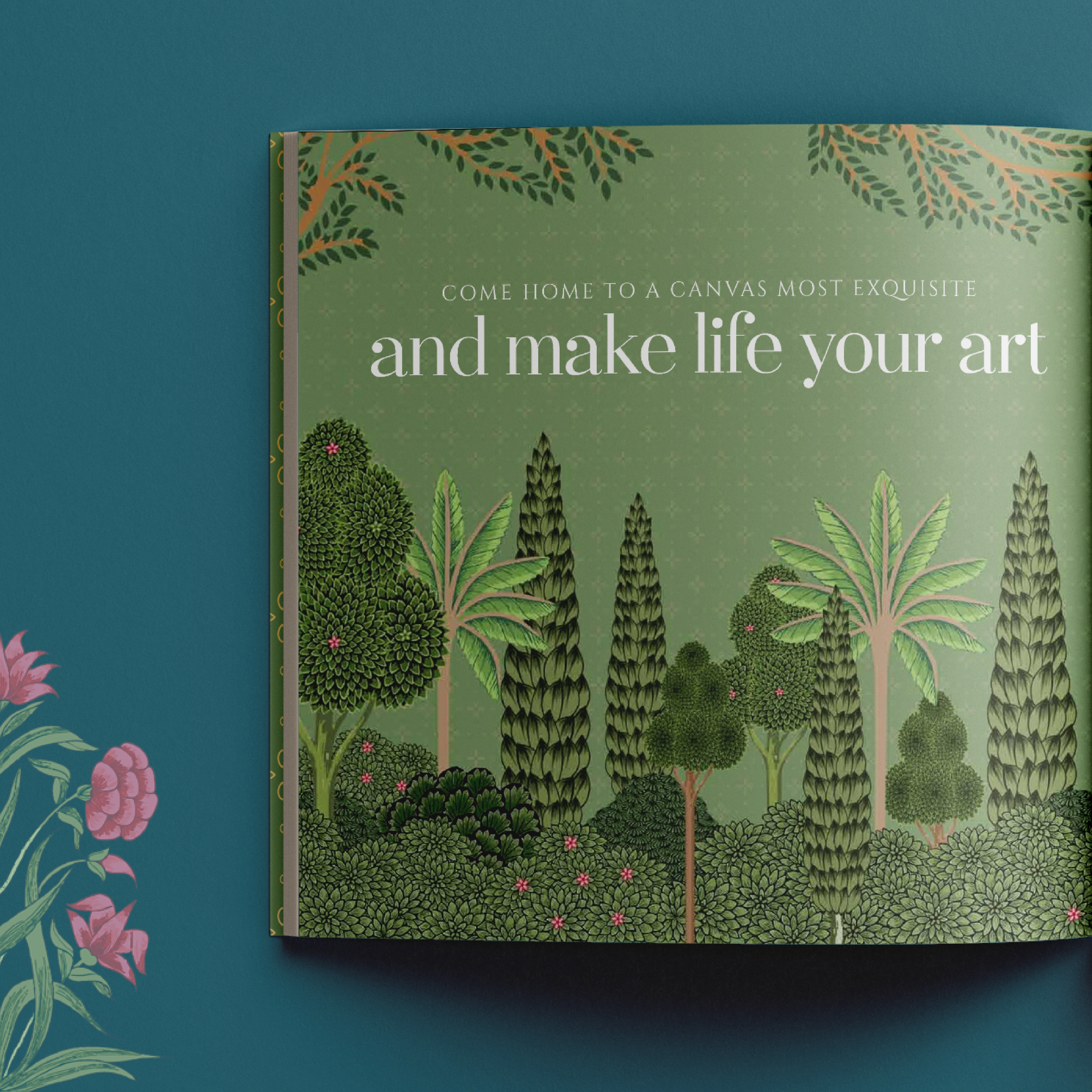
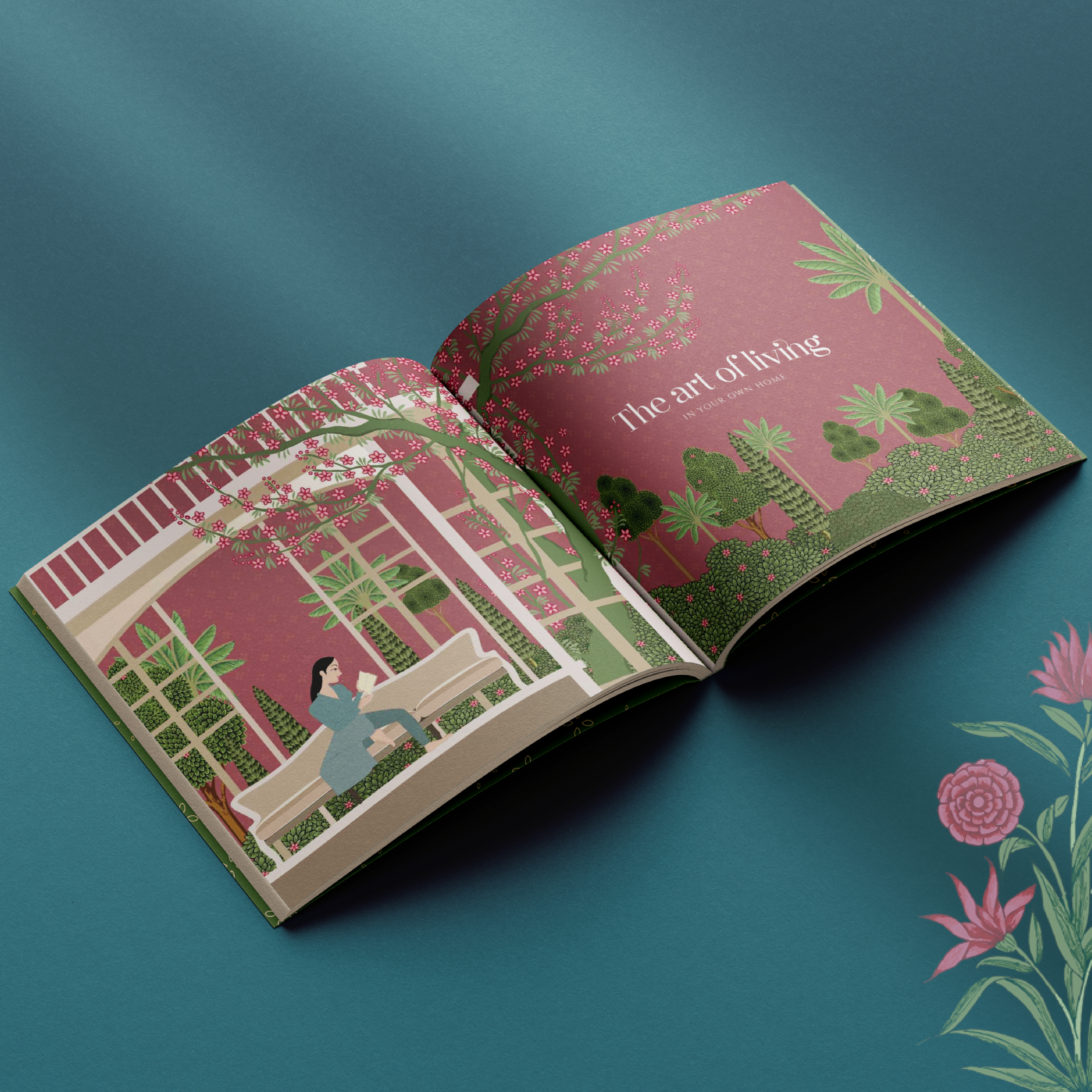
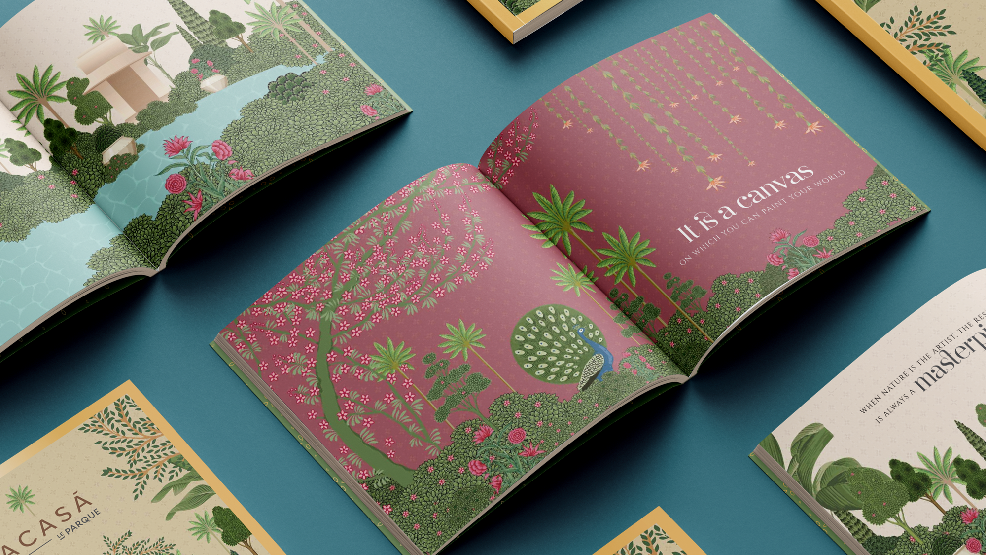
We started with an in-depth study of our location, competition, and most importantly, our consumers, from which we were able to unearth key insights that helped us position Acasa through the tagline- ‘Where Life Imitates Art.’ Here, life and living is stimulated and enhanced, akin to the sensation one experiences when engaging with art or music.
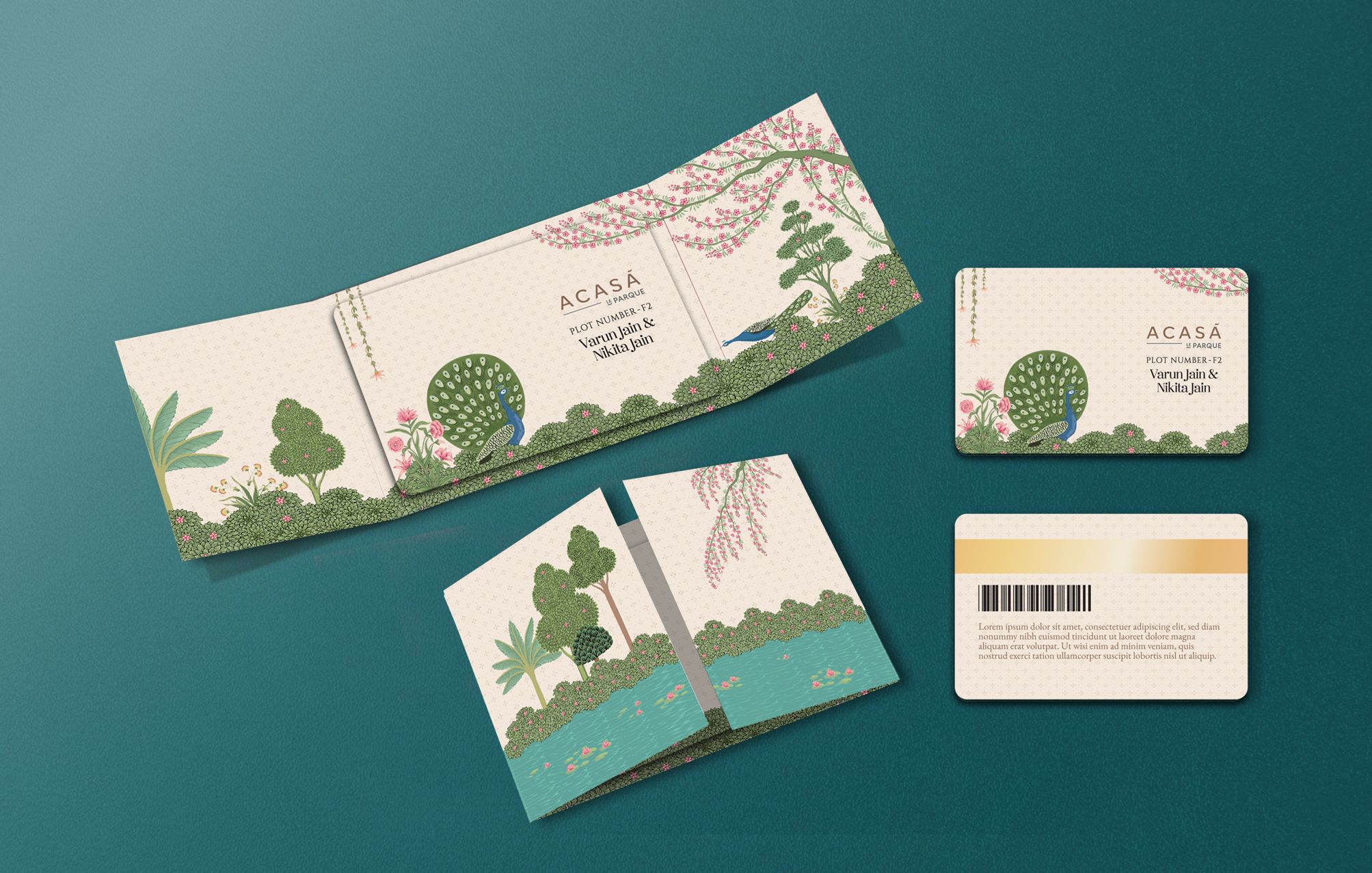
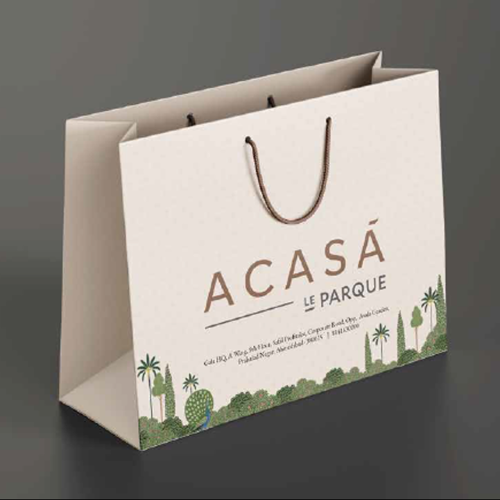
Since the target, offering, and audience for both the sectors had to be different, we had to rethink our nomenclature to fit within the larger theme of Le Parque, and thus, renamed Ashoka as ‘Acasa’- which is the Romanian word for ‘Home’ in the context of family & love.
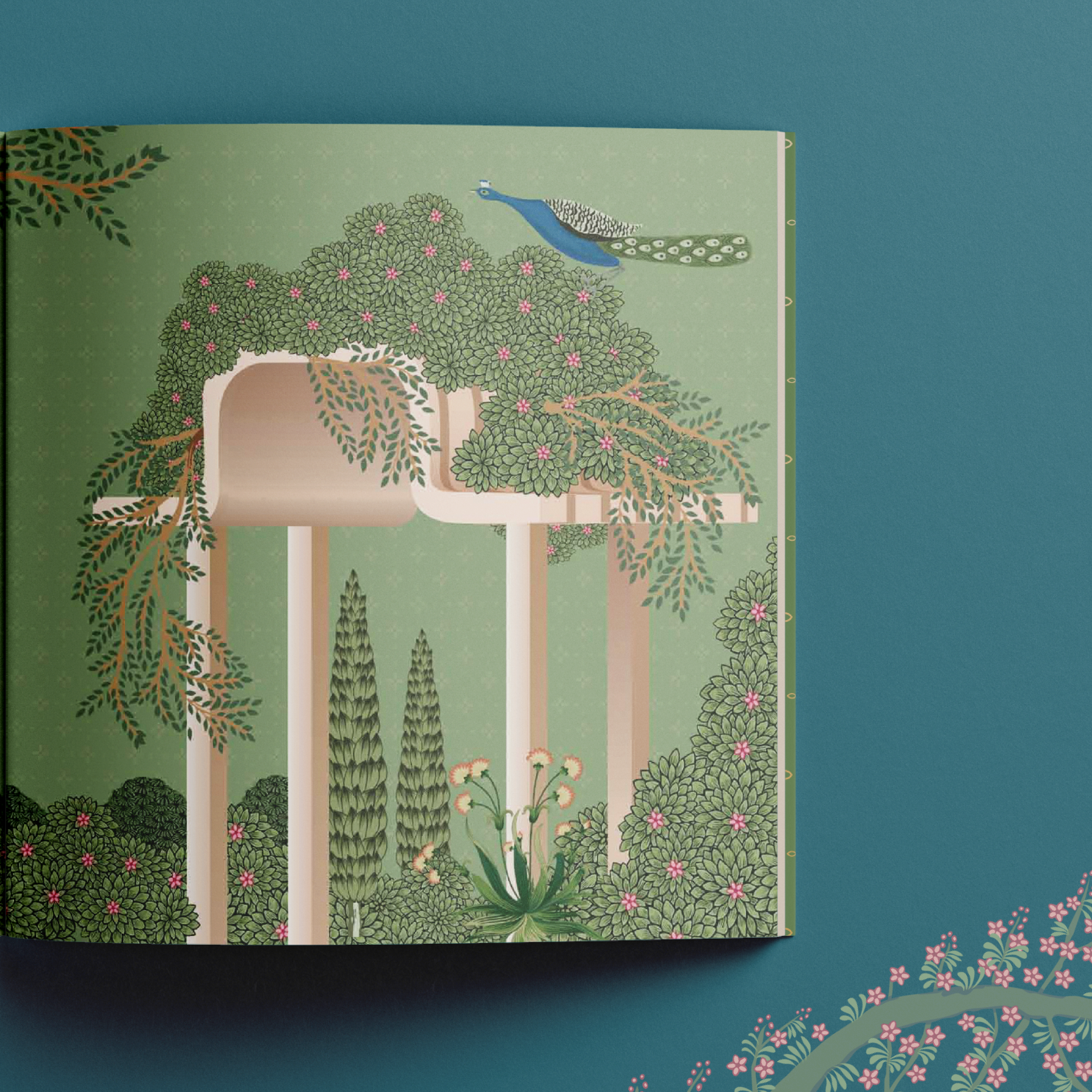
We built upon the overarching theme of lush landscapes and life amidst nature, ensuring distinct identities for each sector while creating a flexible nomenclature system that seamlessly accommodates future sectors.
We built Acasa’s visual theme on ‘Traditional Indian Miniature Paintings.’ This theme brought alive the sector’s fusion architecture through a series of unique custom-made illustrations reimagined in a contemporary style.

