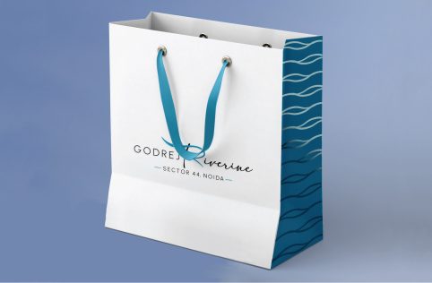
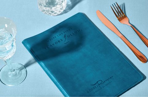
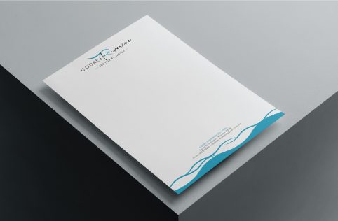
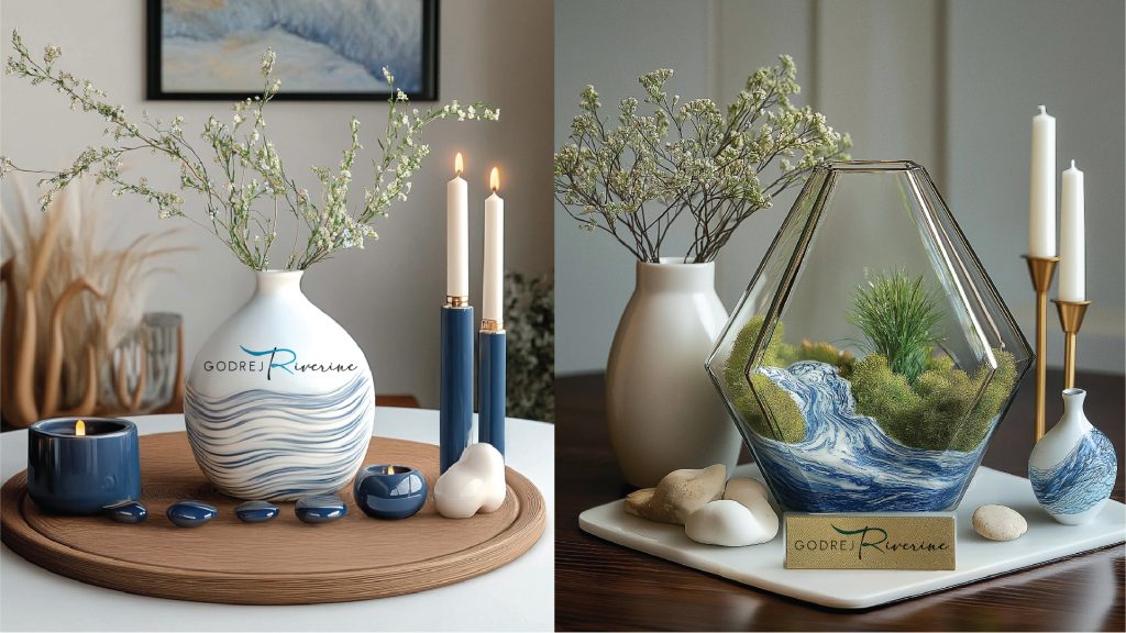
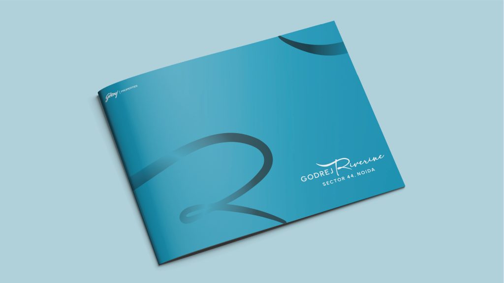
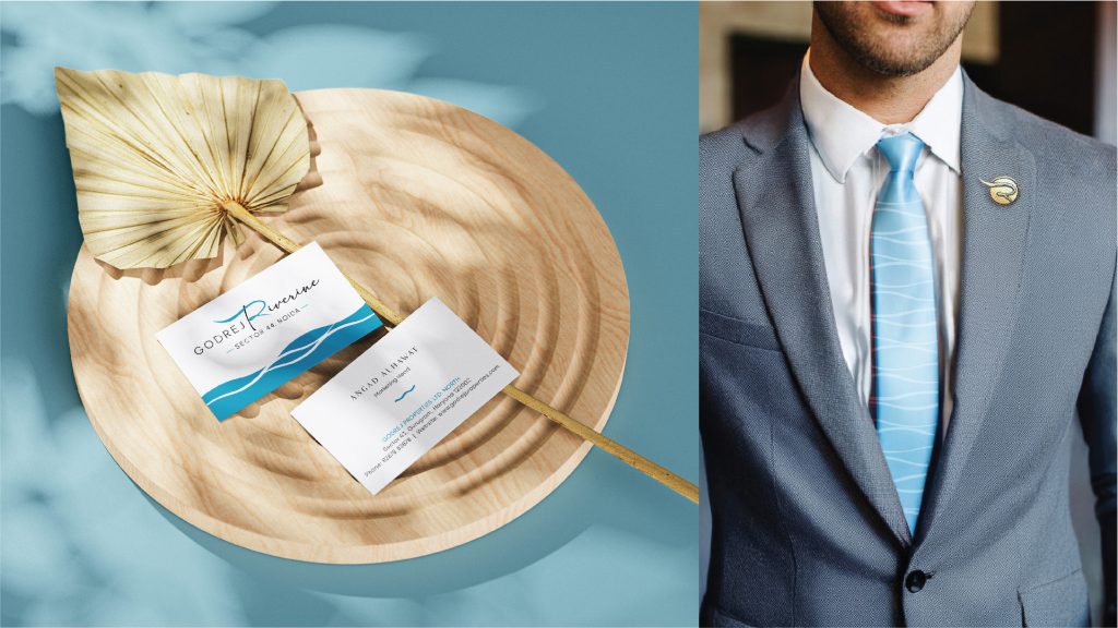
Inspired by the river’s fluidity, the Riverine brand identity was thoughtfully crafted to embody a sense of movement, dynamism, and serenity—qualities that mirror the natural rhythm and elegance of a river.
At the core of this identity is a bold, flowing ‘R’ that symbolises the continuous journey of water—strong, purposeful, and ever-evolving. This iconic mark serves as a visual metaphor for life at Riverine: grounded in calm yet full of momentum. A refined colour palette of soft, muted blues and greys evokes a sense of tranquillity, inviting a feeling of ease and connection to nature.
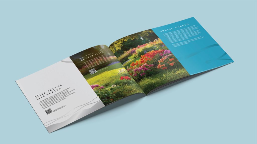
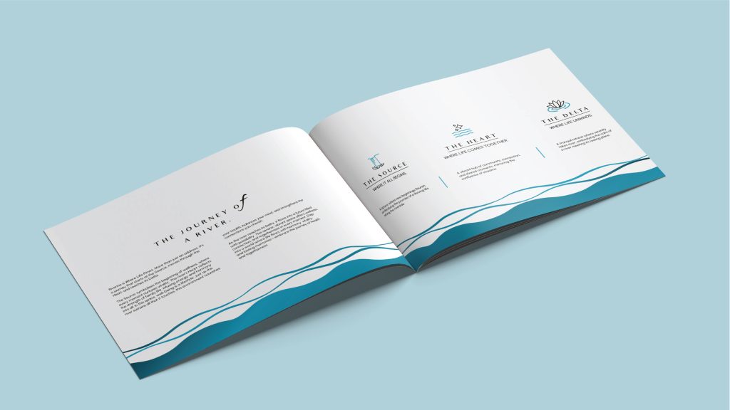
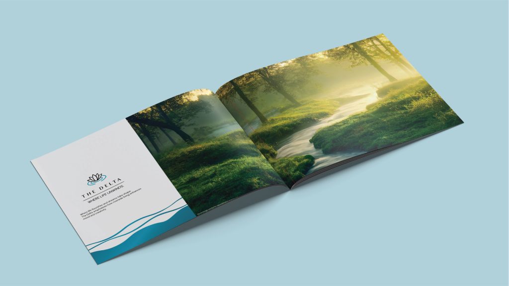
The use of a curvilinear design language across all brand touchpoints—from digital interfaces and brochures to on-site signage—ensures a cohesive and immersive visual experience. Every line and contour was intentionally designed to feel fluid and organic, echoing the bends and arcs of a river. The overall identity not only captures the project’s proximity to water but also reflects its promise: a lifestyle of balance, flow, and quiet sophistication. – please use this forr the branding section.